Course · Module 1 · Lesson 2
First run: what's on the screen
Before touching settings, learn the three elements of the readout. Everything the dashboard shows boils down to one idea: levels from several independent indicators, grouped into zones, with a strength score and trend context.
The zone table
The table in the chart corner is the primary readout. Columns:
| Column | Meaning |
|---|---|
| Side | RESISTANCE (above price) or SUPPORT (below price) |
| Zone | The zone’s price range, or a single level |
| Sources | Which indicators form the zone (e.g. ATR TS 1W + Camarilla H3 1M) |
| TF | Timeframes the levels come from |
| Σ | Summed zone strength — the higher, the more independent methods point at this area |
| Distance | Distance from current price in % |
| Breakout chance | Percentage + label: High ≥66, Medium ≥40, Low <40 |
The table only shows zones within the distance filter (a few percent from price by default) — far-away levels don’t clutter the readout.
Labels at levels
Each zone gets an on-chart label:
Σ7 · 68% HighRead it as: “a zone of strength 7; if price gets here, trend context gives a 68% breakout chance — i.e. high”. Turning on showLabelNames expands the label with the component indicators and their points — useful while learning, usually unnecessary day-to-day.
An example from a live chart
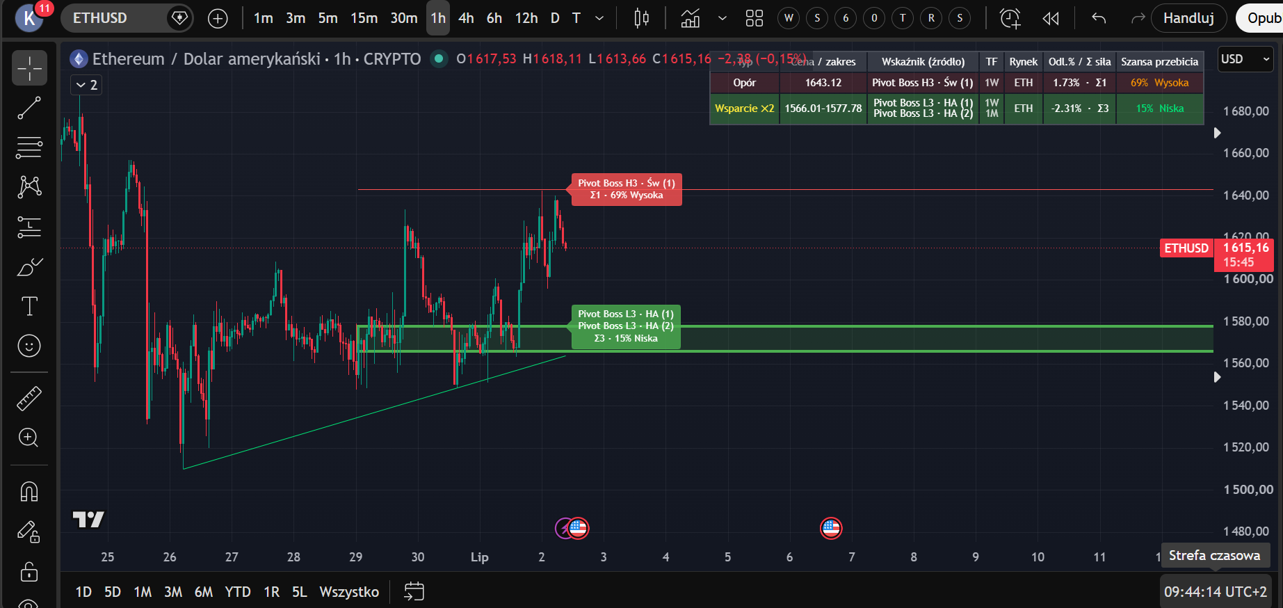
Let’s read this screenshot (ETH/USD, 1h) together, table row by row:
- Resistance 1643.12 — one source: Camarilla H3 from the weekly timeframe. Σ1, a weak zone. Distance +1.73% from price. Breakout chance 69% — High: the trend presses, and only a single level defends.
- Support ×2, range 1566.01–1577.78 — two sources (weekly L3 + monthly L3) merged into one zone. Σ3, distance −2.31%. Breakout chance 15% — Low: a stronger zone, weaker downward pressure.
Note the relationship that will keep coming back through the course: a stronger zone (higher Σ) → a lower breakout chance. That’s not a coincidence — it’s how the formula from the limitations lesson is built.
The nearest zone (box/line)
The dashboard also draws the nearest S/R zone — a box (when the zone has a range) or a line (a single level). It’s the at-a-glance element: without reading the table you see what price is approaching first.
Regular candles or Heikin Ashi?
Some source indicators (ATR Trailing Stop) are computed in parallel on regular candles and Heikin Ashi — both variants produce levels. Your chart type doesn’t change how the dashboard works; it only changes what you see on price. In this course we work on regular candles — they’re unambiguous about actual traded prices.
A reflex to avoid
New users often treat the first green/red label as a “signal”. The dashboard does not generate signals. A high breakout chance is not a buy instruction — it’s context: the trend is pressing harder than the zone typically defends. What you do with that depends on your plan — modules 3 and 4.
Lesson 2 checklist: you know every table column → you can read a
Σ · % · levellabel → you understand that a high breakout chance ≠ an entry signal.
Educational material. Not investment advice.